Great bar with an art gallery attached

DSCF0158

Sometimes it isn’t easy doing history and heritage for a living.  Sometimes we have to tell people that they are wrong for liking a particular building for various technical reasons, which we will tell them at great length. Mostly they just back away slowly and find someone else to talk to at the dinner party. But it is a duty we will not shirk. Welcome to the PICA Building.

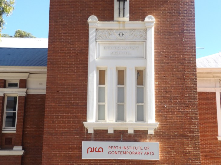
Designed by George Temple Poole and opening in 1897, the Government School is clearly in a classical style, with a sort-of Italianate tower between two wings. Built as a primary school, the reason for its classical details is initially a bit of a mystery. Especially when the internal design was based on the most modern educational principles of the day, with a central double-height hall and classrooms leading off this. Boys on the ground floor, and girls on top.

Further, it is basically a steel frame with concrete floors, with pipes and other services concealed between double brick walls. This is a very modern building, both in intention and construction, so why does it have a historic façade?

The answer probably lies in the school’s controversial location: the middle of a city. By the 1890s it was thought that kids needed fresh air and large ovals to become healthy citizens. The James Street school had tiny playgrounds and no oval at all. In addition, it was located near corrupting influences, such as pubs, prostitutes, and rampant capitalism in the form of retail and industry. This was not a place to develop the young mind to its full potential.

Another issue facing the architect was that government schools were themselves controversial. While the government had been involved in education for some time, it was only towards the end of the 19th century it started taking a leading role. Some parents worried that compulsory education would turn out over-educated children unsuited to be good housewives or labourers. Poole had to find an architectural solution which would pacify the concerns over both location and intention.

He chose to envelop a thoroughly modern school building with a traditional design. This would emphasise the importance of the building, its distinctiveness in a commercial environment, and show this was a great place to send your kids. So far, so good, but it all goes downhill from here.

120x165mm

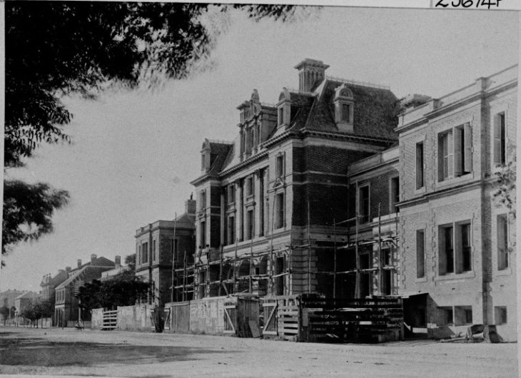
As early as 1909, one architectural critic noted that the school was “notable for its large dimensions rather than for graceful design”. The style of building Poole intended requires that the central tower has two identical wings. A glance at the PICA Building shows that the two wings have nothing in common. The bricks are a different colour, the windows are different proportions, and there is a decorative frieze on the west wing (right as you look at the building) completely absent on the east. No competent architect would have designed the building this way, and Poole was far better than merely competent, so the only conclusion is that a lesser hand designed the west wing later. But not too much later, since the earliest photographs we can trace all show both wings as they are today,

Then there is the central tower. This is meant to be Venetian, but fails dismally. It is not hard to find good Italianate towers around the world, which all show elements of good design. Here, for example, is a fire station in Brandon, Manitoba, by W.A. Elliott in 1911.

brandon-fire-tower

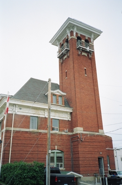
The vertical element is stressed through the brickwork at the corners, and the wrought iron balconies add to the beauty of the whole. Or consider a local example, Bunbury High School by William Hardwick in 1923. Perhaps a little more Spanish than Italian, the vertical is stressed by the openings in the tower, and it was described as adding a ‘monastic’ air to the school.

Bunbury high

Now compare the tower on the PICA Building. There is no sense of the vertical, the brickwork fails to convey an upwards movement, and the whole thing looks squat and, to be honest, fairly ugly. Even an attempt at a vertical element on the front is swamped by the brickwork and fails to do its job.

DSCF0165

Was there a budget cut or was this Poole’s original intent? We will never know because the original plans have been lost, and we only have ‘as built’ blueprints from the 1920s.

So, having criticised the building, does this mean it should be knocked down? Not at all. There are many other reasons for keeping PICA. Asides from the environmental costs of bowling over an old building and putting up a new one, it functions as a popular art gallery.

But most of all, we at Dodgy Perth would chain ourselves to railings to stop anyone taking away the PICA Bar, which is where you will often find us after a hard fifteen minutes of research at the State Records Office or State Library. Sometimes we don’t even last fifteen minutes before hitting the bar. So it has to stay. Seriously.

A bit of Paris in Perth

DSCF0223.JPG

Next time you drop into Petition, make sure to order something French. They have a Petit Chablis which has good reviews, so that’s on our must-drink list (yes, we have a must-drink list) when we take another look at George Temple Poole’s Old GPO building. This is now part of the Central Government Buildings or, as they are more commonly known, the Old Treasury.

One of the things architects fear the most, other than mislaying their designer glasses, is being seen as derivative. A difficult job to undertake is designing additions to an existing building or set of buildings. The new work has to complement the structures already there, but not copy them so closely that you don’t look an original architect. In other words, the architect must triumph over their predecessor, but not look too arrogant while doing so. This is a very difficult feat to pull off, but it is exactly what George Temple Poole achieved with his additions to the Central Government Buildings, which opened in 1890.

Poole was faced with a site which already had two older building, both designed by Richard Roach Jewell, and are now the wings along Barrack Street and Cathedral Avenue. These were proving completely inadequate for the needs of civil servants, and Poole was asked to link the two buildings with new offices and to include a post office while he was at it. His solution was so effective that some architectural critics believe he was simply showing ‘architectural good manners’ and respecting Jewell’s earlier work. He was most definitely not.

The only acknowledgement of the existing buildings was to use Flemish bond brickwork, which is alternating ‘headers’ and ‘stretchers’, usually in two different colours. Speaking of colour, have a look at how the new bricks are completely different to the older ones. This is most noticeable in the third storey of each of the wings, since Jewell’s original buildings only had two floors and a flat roof. No attempt was made to match the shades of the bricks.

treasury1

Under construction, 1889

The inspiration for the central element on St George’s Terrace was definitely French architecture. One possible model is the Hotel de Ville in Paris, which shows similar chimneys, Mansard rooflines, and dormer windows. But Poole did not copy this building, he just took some of the ratios and overall concept, adding in a little English Queen Anne style for the windows and other details. Poole was declaring that this was his building, and his alone.

HotelVilleParis

To link the central element to the older buildings, the setbacks either side of the middle gives more prominence to Poole’s contribution, and once again clearly shows what is old and what is new. Finally, the windows on Jewell’s portion were redecorated with the same design as the new ones, and when third storeys were added, they also got Mansard roofs. The new skin on Jewell’s earlier buildings transformed their character, making them just another part of Poole’s overall project. His project.

And it works. The style conformed to expectations for what a government building should look like, integrated existing buildings, and created what was the most impressive building in Perth at the time. Plus, this was no simple addition, it was a novel work, one which showed Poole could meet head on the circumstances he was faced with and triumph as an original architect. Not bad for a simple linking element.

And now for that glass of Petit Chablis to celebrate our unusual French(ish) building on St George’s Terrace.

Our glorified saloon

165x215mm

You probably know that to get a building heritage listed, the Heritage Council (aka the Style Council) has to give reasons why it should go on the list. You can find these on the Style Council’s website.

So, let’s take a look at why Parliament House deserves heritage protection:

The 1904 section of the building expresses the sense of grandeur and pride associated with the establishment of Parliament House & Grounds, through both the external and internal design, finishes and furnishings and by the use of Western Australian building materials.

To summarise: According to the Style Council, when it opened people loved Parliament House.

But did they really?

Well, the bare-armed worker who had helped construct the place certainly didn’t love it. In his opinion it was a waste of money and he looked forward to the day when a Labour Government would dispense with “this tommy-rot, and spend all that good brass feeding the poor.”

Mr J. M. Kelly wasn’t too concerned about the poor. He was just concerned about the poor design, which he called a “blot on the landscape”.

I have come to the conclusion that the new Parliament Houses being erected are mean, paltry, and but a sorry housing for the legislators of Western Australia.

Ouch. But do go on Mr Kelly:

On its western side, past which a fine broad road leads you, it has an almost despicable appearance, reminding one of a railway goods shed, with its squat, stuccoed walls.

Okay, but somebody must have liked the design. Perhaps legendary architect George Temple Poole?

It is fair to deduce that the State is on the eve of expending £210,000 for a building of the class of construction and work generally which cannot be considered sufficient for the monumental character of a State Parliament House.

As a skilled architect, maybe Mr Temple Poole has too high expectation. Perhaps we should just ask a civil engineer what they think:

The proposed building has no pretensions whatever to architectural effect in any sense of the term. Judging from the plans and elevations offered for inspection the ‘tout ensemble’ discloses a lop-sided pile of buildings of the most incongruous nondescript order of the cheap and nasty type.

Ouch and ouch again.

But dear reader, you’ve probably noticed that we’ve been unfair. All of these criticisms were made before Parliament House opened. Once it was open, surely the “sense of grandeur and pride” (as the Style Council puts it) will become clear to the people of Perth.

So let’s ask the people on opening day what they thought:

The visitors had time to criticise the extraordinary colour scheme of the Assembly Chamber, count the hundreds of black swans swimming the blue sea of carpet, comment on the dizzy height of the galleries, and draw comparisons—born of the wearying display of stained glass and coloured wood—between the general appearance of the Chamber and that of a glorified saloon.

A ‘glorified saloon’ is more generous than ‘cheap and nasty’ pile of buildings. But not much. And certainly not what you might expect from the Style Council’s glowing description of the external and internal design.

Just because it’s on the State Register doesn’t mean anyone liked it at the time.

Proposed Parliament House. Not built.

Proposed Parliament House. Not built.